Design is one of those words that gets used for everything – logos, chairs, websites, even coffee cups. As a Dane, I grew up surrounded by it without really thinking about it. It was just… there. The chair was comfortable, the poster was readable, the street signage made sense, the lamp didn’t blind you at the dinner table.
Only later do you realise: that ease is not an accident. It’s design doing its quiet job.
In this article, I want to answer a simple but slippery question:
What is design – from a Danish perspective?
I’ll talk about where this mindset comes from, what it means in practice, and how it shapes the way I work with brands, websites and layouts today.
No pipe-smoking professors, no overcomplicated theory. Just honest design, with a Danish accent and a bit of hygge.

Why design actually matters (and not just for “pretty things”)
Let’s start with the obvious: yes, design makes things look nicer.
But if that’s all it does, it’s failed.
Good design helps people:
- Understand where they are
- Find what they need
- Decide what to do next
- Feel something – trust, calm, curiosity, excitement
When a website is confusing, a brochure is cluttered, or a logo feels cheap, people might not analyse why – they just quietly lose confidence and move on.
From a business point of view, design affects:
- Trust – “Do I believe this company will look after me?”
- Ease – “Can I find what I need without getting annoyed?”
- Memory – “Will I remember this brand tomorrow?”
- Action – “Do I feel ready to book, buy or enquire?”
In other words: design is not a garnish; it’s the plate everything is served on.

So… what is design, really?
There are a thousand definitions, but here’s a simple, Danish-flavoured one:
Design is the set of decisions that make something useful, understandable and pleasant to use.
Notice what’s not in there: trends, fancy effects, or decoration for the sake of it.
Design is:
- Problem-solving – What is this for? Who is it for? What needs to happen?
- Communication – What do people need to see, read and understand first?
- Prioritisation – What matters most, and what can quietly disappear?
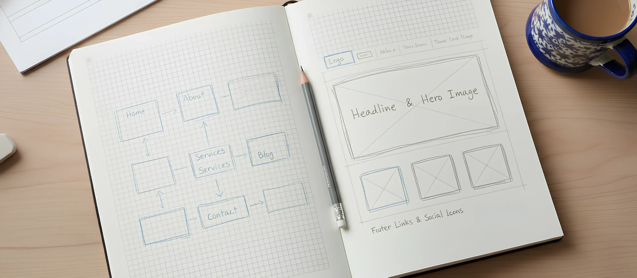
In graphic and digital work, that shows up in things like:
- Clear hierarchy (headings, subheadings, body text)
- Sensible navigation (especially on mobile)
- Calm layouts with enough breathing room
- Typography that doesn’t fight the content
- Colour used carefully, not everywhere
All of this fits very naturally with Danish design culture – where function, clarity and human comfort are right at the centre.


A very short history of Danish & Scandinavian design (without turning this into a museum tour)
Scandinavian design – including Danish design – became known worldwide in the mid-20th century for exactly three things: simplicity, minimalism and functionality.
Think of the classic Danish chairs and lamps: clean lines, natural materials, no unnecessary ornament. They weren’t created to show off; they were created to make everyday life better – to sit well, light well, and last. If you’ve ever fallen in love with a piece of Danish modern furniture, you’ve met this philosophy in real life.
Several ideas sit behind this:
- Form follows function
- Quality over quantity
- Honest materials
- Calm simplicity
Over time, this way of thinking moved far beyond furniture. You can see the same values in interiors, product design, branding – and, increasingly, in digital design, UX and service design.
Today, organisations like the Danish Design Center work with businesses and public bodies to apply those principles to everything from products to services and digital experiences.

The Danish design mindset – in plain language
Lots of articles talk about Danish design in big, serious terms. Let’s keep it simple and human.
Here are the principles I see again and again, and that I work with every day.
Functionality: it has to work first
Danish design starts with function. If a chair looks beautiful but you can’t sit in it for more than ten minutes, it’s not good design. The same goes for a website or a brochure.
In practical terms:
- Can people find what they’re looking for quickly?
- Does the content answer their real questions?
- Is it obvious what to click, where to scroll, how to get in touch?
Design that doesn’t work in real life is just an expensive illustration.
Simplicity: clear, not boring
Simplicity is not about making everything white and empty. It’s about making it easy to understand.
In graphic/digital design, simplicity shows up in:
- Fewer typefaces, used consistently
- A limited colour palette, used with intention
- One main message per screen or page
- Layouts that guide the eye in a natural order
The goal is not to impress other designers. It’s to make life easier for the person on the other side of the screen or the page.
Materials & craftsmanship – even in digital work
Traditional Danish design puts a lot of emphasis on materials and craftsmanship: solid wood, good joinery, careful details that you only notice when you use the piece every day.
In graphic design, our “materials” are different:
- Typography
- Colour
- Grids and spacing
- Image style
- Micro-details (button radius, line-height, alignment)
Craftsmanship here means: nothing is random. Headings line up. Margins are consistent. Buttons feel “finished”. The whole thing has a quiet confidence, even if the user never consciously thinks about why.
Innovation: small, thoughtful improvements
Innovation in Danish design is rarely about shouting, “Look at this wild new thing!” It’s more often about making something a little smarter, easier or more flexible.
- A storage solution that doubles as seating
- A lamp that adjusts easily to different activities
- A website module that can be reused in multiple places without breaking
In graphic and web design, this might be:
- A layout system that adapts neatly between desktop and mobile
- Content blocks that can be reused without losing structure
- Designs that play nicely with real-world constraints (WordPress, Shopify, email clients)

Hygge: comfort, warmth and human scale
You can’t talk about Danish culture without mentioning hygge – that feeling of cosiness, comfort and being at ease.
In design, it becomes:
- Friendly, human tone of voice
- Warmth in the images and colours
- Enough white space that the page doesn’t feel stressful
- Details that feel considerate rather than flashy
It’s the difference between a website that feels like a calm conversation and one that feels like a shouting match.
Climate & adaptability: making life easier in a long winter
Scandinavian minimalism and design culture didn’t come from nowhere. The long, dark winters and the need for comfortable, practical interiors strongly influenced the design approach: spaces needed to be functional, bright and calm to make life indoors pleasant.
That same logic – “How do we make everyday life easier, calmer, more liveable?” – translates very nicely to digital experiences.
No one wants to fight with a website at the end of a long day. Good design doesn’t add to the noise; it quietly removes friction.

From furniture to pixels: what this means for graphic & digital design
A lot of articles about Danish design focus on furniture and interiors. But the same values show up clearly in graphic design and digital work.
If you look at principles of user experience from places like the Nielsen Norman Group (founded by Danish usability expert Jakob Nielsen), you’ll see a lot of overlap between Scandinavian design values and good UX design – clarity, simplicity, respect for the user’s time and attention.
Here’s how this translates into everyday design work.
Typography: clear, legible, unpretentious
Danish/Scandinavian-influenced typography tends to be:
- Clean and modern (sans serif)
- Used in a small set of styles (e.g. heading, subheading, body)
- Structured to create a clear hierarchy
The goal is to support the content. The typeface doesn’t need to shout; it needs to be easy to read on a grey Tuesday on a small phone.
Layout: calm grids and breathing space
The furniture version is “clean lines”; the graphic version is clear grids.
- Consistent column structure
- Generous margins and line-spacing
- Grouping related information together
- Avoiding cluttered corners and “stuffed” sections
This makes it easier for the eye to scan and the brain to process information – especially important when people are distracted or tired.
Colour: restrained but not cold
Danish design often favours neutral, natural palettes with small accents of stronger colour.
In branding and web, that usually looks like:
- A primary brand colour
- One or two supporting colours
- Lots of neutral space (white, off-white, soft greys, warm beiges)
The result feels calm and considered, not like a box of highlighters exploded on the screen.
Content first, decoration second
Danish design thinking is very comfortable saying “no” to things that don’t serve the purpose.
In digital projects, that might mean:
- Removing half the homepage sections to make the core message clearer
- Cutting long paragraphs into short, scannable ones
- Saying no to sliders or animations that add confusion without real value
When we edit down, we do it with SEO in mind – keeping the useful, keyword-rich content and losing the bits no human ever reads.
The question is always: does this help the user? If not, it probably goes.
How this Danish mindset influences the way I work
This is where it becomes personal.
Growing up with Danish design around you changes what you consider “normal”. You get used to things being:
- Clear rather than clever
- Understated rather than loud
- Practical rather than performative
When I work with clients – whether that’s a small business needing a website, a brand refresh, or ongoing marketing materials – this mindset comes with me.
It shapes how I approach web design projects, visual identities and day-to-day marketing assets, from the first conversation to the final layouts.
I start with people, not pixels
Before I open any design software, I ask:
- Who are we talking to?
- What do they need to find or understand?
- What is the real job of this design?
- Where and how will people see it?
The answers decide the structure. The structure decides the layout. The layout decides the look.
I treat design as editing
A big part of design is taking things away.
Clients often come with too many messages, too many colours, too many “maybe we could also…” ideas.
The Danish part of my brain quietly asks: What can we remove so the important things stand out?
The result is usually:
- Fewer pages
- Clearer navigation
- Stronger hierarchy
- Less noise – and more impact
I aim for calm, not drama
Bold design has its place, but for most small businesses, what they need is:
- A brand that looks reliable
- A website that feels easy and welcoming
- Communication that sounds human and honest
I want designs people are happy to live with for years – not something that feels dated after six months because a trend changed.
I prefer collaboration over “big reveal” moments
Instead of disappearing for weeks and returning with a dramatic presentation, I prefer:
- Sharing ideas early
- Getting feedback on structure and content
- Refining together in small steps
It’s less theatrical, but more realistic.
Simple, concrete examples
A few examples of how a Danish design mindset changes real projects.
Example 1: A website that stops shouting
A small business has a website full of:
- Dense text
- Sliding banners
- Many confusing menu items
- Lots of bright colours
The Danish approach:
- Clarify the goal
- Simplify the structure
- Calm the visuals
- Make it human
The result: “Ahh… this makes sense now.”
Example 2: A brand identity that breathes
The Danish approach:
- Simple, flexible logo
- Limited colour palette
- One main typeface
- A graphic system that’s subtle but distinctive
The result: a brand that feels confident without trying too hard.
Example 3: A layout that respects the reader
The Danish approach:
- Clear hierarchy
- A reliable grid
- Comfortable spacing
- Purposeful images
The result: a piece someone can read without needing a lie down afterwards.
Why this approach works so well for small businesses
Danish-style design is perfect for small businesses because:
- clarity builds trust
- timeless design lasts longer
- fewer moving parts = fewer maintenance headaches
- it’s easier to stay consistent across platforms
Most importantly, it doesn’t require a huge budget to be effective. Just thoughtful decisions.
How you can borrow a bit of Danish design thinking
You don’t have to live in Copenhagen to use these ideas.
Try these:
Ask functional questions first
What do people need to do here? What do they need to know first?
Reduce – but smartly
Remove waffle, not value. Keep SEO-rich, helpful content. Let go of filler.
Tidy your typography
Pick one main typeface, define styles, keep spacing consistent.
Calm your colours
One main colour, one accent, neutrals around them.
Add hygge
Give your design warmth, friendliness and breathing room.
Conclusion – and an honest CTA
Design, from a Danish perspective, is not about perfection or showing off. It’s about making everyday things – chairs, lamps, websites, brands – easier, clearer and more enjoyable to live with.
The key ideas are simple:
- Functionality first
- Simplicity
- Craftsmanship
- Warmth and comfort
- Longevity over trends
If you’d like your brand or website to feel more clear, calm and considered, then we’re probably a good match.
If you’re:
- A small business owner whose visuals feel “a bit all over the place”, or
- Planning a new website or brand and want it to feel quietly confident rather than shouty,
…I’d love to help.
You bring your expertise and your story.
I’ll bring the Danish design mindset, the grids, the typography, the calm.
Together, we can create something that feels simple on the surface – and very thoughtfully designed underneath. If you’d like to chat about a project, you can get in touch with me here.